
Like the other major studios in recent years, studios love to add variations to their classic logos. There is possibly one company that has the most fun logo variations: Walt Disney Pictures. Their movies and logo changes have been extremely creative over the years and deserve a bit of recognition. Here's a bunch of them to compare.
The most nostalgic and personal favorite for many is this Walt Disney Pictures logo (which ran from 1986-2006).

Their foray into CGI animated films began with Pixar's Toy Story (1995) and featured a full CGI castle and was used with Randy Newman's new logo music.

With Tarzan (1999), they started changing the background design of the regular logo.

With Inspector Gadget (1999), the logo added a big mechanical wheel among the castle outline.

Atlantis: The Lost Empire (2001) has the castle flitting in the dark depths.

Lilo and Stitch (2002) has the logo get abducted by aliens.

Home on the Range (2004) has the castle logo branded.

Chicken Little (2005) features a slightly different CGI logo, to showcase the film's 3D release.

The Pirates of the Caribbean: Dead Man's Chest (2006) was the first to feature the updated castle logo, typically with fireworks. When You Wish Upon a Star arranged by Mark Mancina appears most times after this point.

The Santa Clause 3 (2006) has the castle logo appear inside a snowglobe.

Enchanted (2007) zooms into the castle itself as the film starts.

Bedtime Stories (2008) has the whole logo turn pages, like a pop up book.

Tron: Legacy (2010) has the logo formed out of the lights of the Grid.

The Prom (2011) begins like a pencil drawing in a scrapbook.

The Muppets (2011) premiered the slightly new logo that only says Disney. This version has been the new standard.

John Carter (2012) is like several films to tint the entire logo - this one in Martian red.

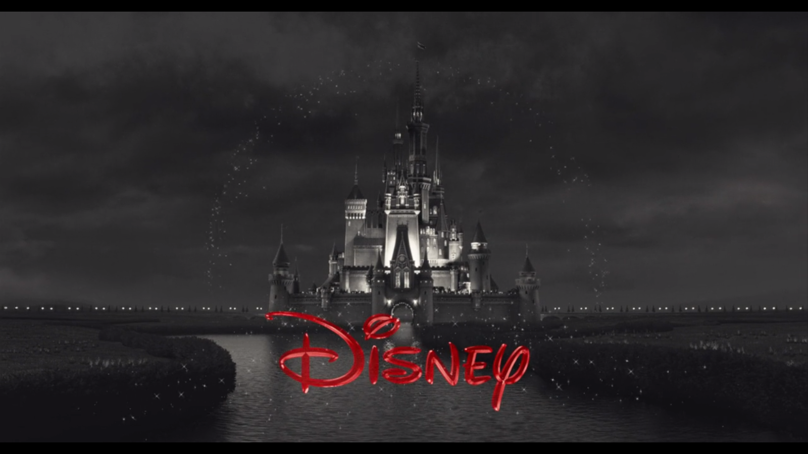
Frankenweenie (2012) is in black and white, with a musical stinger by Danny Elfman.

Oz the Great and Powerful (2013) begins like a shadow play, zooming into the castle gate, with Danny Elfman's theme playing.

Saving Mr. Banks (2013) features a retro-style logo to match the 1960's Disney era.

Maleficent (2014) features a King Stefan's castle as it zooms in to begin the film.

Into the Woods (2014) is darker, as the arc transforms into the moon and the woods appear on the sides.

Cinderella (2015) features a different castle with a brighter backdrop.

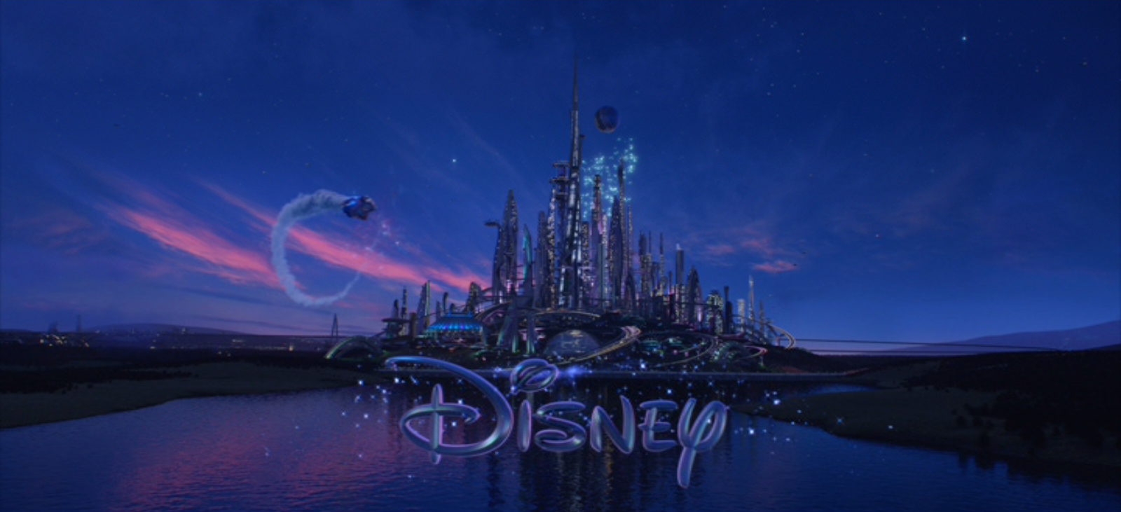
Tomorrowland (2015) replaces the skyline with the futuristic Tomorrowland buildings.
The Jungle Book (2016) has a recreated hand drawn castle and fireworks, which zoom out to the jungle which transitions to full CGI.

Beauty and the Beast (2017) shows the Beast's castle (with the village behind it).

Pirates of the Caribbean: Dead Men Tell No Tales (2017) darkens the castle and the sky and the flag atop the castle is replaced with the Jolly Roger flag.

Coco (2017) doesn't change the main logo design, but a Mariachi version of the fanfare is played.
A Wrinkle in Time (2018) changes like the film's tesseract at the last second of the logo.

Incredibles 2 (2018) is done in red and gold and uses the comic style design. (Rare change for a Pixar film)

Christopher Robin (2018) has the castle transform into a hand drawn sketch to match the book pages of the prologue.

Mary Poppins Returns (2018) has the castle surrounded by London sights in the background.

Mulan (2020) features Chinese background scenery and the castle the Enchanted Storybook castle in Shanghai Disneyland and the arc is made by a phoenix.

Cruella (2021) is in gray with 1960's London in the background surrounded by lightning and thunder with the text arriving in red.
Chip 'n Dale: Rescue Rangers (2022) ends with lasers zapping parts of the castle. We see castles from Frozen, The Little Mermaid, Incredibles 2 variation.

Pinocchio (2022) adds Jiminy Cricket floating down and singing the words to "When You Wish Upon A Star".

Hocus Pocus 2 (2022) turns to a darker atmosphere which blends into the John Debney score

Disenchanted (2022) the normal logo transforms the castle and background to the 2D style of Andalasia.

Starting with Strange World (2022), we see the logo refreshed. We pass more locations, up a waterfall to a transforming castle surrounded by fireworks as the silver text adds Disney 100 - 100 Years of Wonder with a slightly updated musical arrangement by Christophe Beck.


14 Comments
Love that Tron logo.
ReplyDeleteThank you so much, nice post.
DeleteThank you so much, nice post. Ok!!!
DeleteI hate Virtual Logo,Why the「Walt Disney Pictures」Become the
ReplyDelete「Disney」。Disney is Walt Disney Created the Kingdom.No Walt's Word. Disney is not Disney, Disney is Disappear, is Dead.
I like Cartoon Logo.The Bule White Music Castle is my love.
Yep, the new Disney title card will simply say "Disney." It's apart of a broader effort to simplify brand recognition on mobile devices: http://jimhillmedia.com/editor_in_chief1/b/jim_hill/archive/2011/11/29/why-quot-walt-quot-and-quot-pictures-quot-has-been-clipped-off-of-the-new-quot-disney-quot-logo.aspx#.UaPIKWTEpfQ
ReplyDeleteThis comment has been removed by a blog administrator.
ReplyDeleteI like the songs in Walt Disney and I have downloaded them as phone ringtones .
ReplyDeleteHi, Your Walt Disney Pictures Logo is great.
ReplyDeleteThanks for this info. Fm
ReplyDeleteI love this blog amazing
ReplyDeleteThank you so much, nice post.
ReplyDeleteThis was a fascinating read! I’ve always been curious about the evolution of the Walt Disney Pictures logo, and your breakdown of its transformation—from the hand-drawn castle to the modern 3D version—was incredibly insightful. It’s interesting how visual identity can evoke such strong emotions and memories, much like iconic klingeltöne kostenlos that instantly bring back childhood moments. Thanks for sharing this detailed history!
ReplyDeleteThis was a fascinating read! I’ve always been curious about the evolution of the Walt Disney Pictures logo, and your breakdown of its transformation—from the hand-drawn castle to the modern 3D version—was incredibly insightful. It’s interesting how visual identity can evoke such strong emotions and memories, much like iconic klingeltöne kostenlos that instantly bring back childhood moments. Thanks for sharing this detailed history!
ReplyDeleteDisney Intro Theme by Axes Academy
ReplyDelete